 Wonder Dai的博客
CSS3 渐变
CSS 渐变可以分为:线性渐变、径向渐变和锥形渐变三种,渐变不能使用 transition 进行颜色值的过渡,因为渐变最终呈现的只是一张图片,无法对图片进行过渡。
渐变的一大特点是可以创建多种颜色并指定渐变的角度。
大部分人使用最多的应该是线性渐变,也是最简单的渐变,只需要指定两种以上的颜色,就能创建一个平滑的颜色过渡渐变。
CSS3 渐变被划分在了 CSS Images Module Level 3 中,它属于 CSS3 中的图像模块规范,我们可以点击查看每个属性的最新规范定义。
线性渐变
线性渐变通过使用 linear-gradient() 函数创建,可以设置渐变的角度从指定方向开始渐变。
例如:
div {
   /* to right 是一个角度的关键字,会被解析成 90deg, 而 to top 解析成 0deg */
   background: linear-gradient(to right, blue, yellow);
}
角度可以使用一系列的关键字值,也可以使用具体的数值和单位。缺省角度值为 180deg (也就是 to bottom);
For the purpose of this argument, 0deg points upward, and positive angles represent clockwise rotation, so 90deg point toward the right.
The unit identifier may be omitted if the <angle> is zero.
除了渐变的方向可以使用具体的数值外,还可以对渐变的颜色使用数值表示渐变的开始位置和停止位置。
.box-2 {
   /* blue 颜色起始位置是0,渐变到 50%,
      灰色渐变的起始位置是 50% + 1px,结束位置是 100%  */
   background: linear-gradient(3.3deg, blue 50%, gray calc(50% + 1px));
}
除了百分比单位之外,还可以使用像素单位
.box-3 {
   background: linear-gradient(45deg, blue 69px, gray 69px);
}
具体渲染效果如下所示:
这是一个对半分的渐变色,你可能会好奇为什么渐变位置的像素单位是 69px。
这里面必须要有个概念知识要被提及。那就是: gradient-line
gradient-line 由渐变的方向来决定,如果渐变的方向是 to right,那么 gradient-line 就是从左往右。
如果渐变的方向是 45deg,那么 gradient-line 的位置如下图所示:
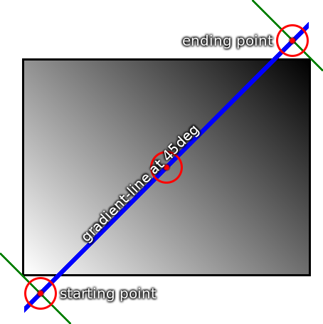
阅读 w3c 中的 CSS Images Module Level 3 规范得知,gradient-line 的长度计算公式为:
A the angle (in any quadrant) defining the gradient line’s direction such that 0 degrees points upwards and positive angles represent clockwise rotation,
W the width of the gradient box,
H the height of the gradient box, The length of the gradient line (between the starting point and ending point) is:
abs(W _ sin(A)) + abs(H _ cos(A))
所以,上面这个示例中,gradient-line 的长度为 Math.abs(100 * Math.sin(45)) + Math.abs(100 * Math.cos(45))
最终的计算结果约等于 138,如果想实现对半分的渐变,则第一个颜色结束位置应该是 138 / 2 = 69px。故 69px 就是这么得来的。
径向渐变
径向渐变为开发者提供绘制圆形、椭圆形的渐变能力。如果说线性渐变可以填充整个容器的背景,那径向渐变则可以在填充背景色的情况下改变背景的形状。
在径向渐变中,颜色不像线性渐变那样从渐变框的一侧平滑地淡化到另一侧,而是从一个点出现并以圆形或椭圆形平滑地向外扩散。
创建一个简单的径向渐变。
div {
   height: 200px;
   background: radial-gradient(#9c27b0, #ff9800);
}
径向渐变的 ending-shape 缺省值是 ellipse, 径向渐变的 start-point 默认是容器的中心位置,end-point 表示容器的大小。
如果要创建一个 circle 形状的渐变,也很简单。
div {
   background: radial-gradient(circle, #000 0%, #ff9800 100%);
}
创建一个 100px 的 圆形渐变。
div {
   background: radial-gradient(100px circle, #000 0%, #ff9800 100%);
}
我们还可以为径向渐变设置 position,需要注意的是渐变的的定位默认是从中心位置开始。
如果设置 circle at top left, 则实际的中心位置如下图所示。
